Thanks to my ol’ buddy Benjamin Moore for sponsoring this post!
I mean, I just can’t understand why every single person doesn’t have a blog. It’s the best thing in the history of ever. Exhibit A: you guys, with your epic advice and helpful opinions on my last post. You’re all my favorites, and you continue to make my little heart flutter with thankfulness. THANK YOU for taking the time to chime in on the paint color for my master bedroom.
In what is probably my fastest turn-around time ever, I already chose a color, got the paint and the room is painted! Awwww yeah. *Brushes off shoulders*
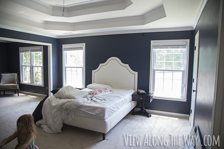
Here again is the before:
And here’s the room when the paint was still drying and we hadn’t put everything back together yet:
(I’m skipping over the process of painting because I’m sure you guys get it: move the furniture, roll things, cut in other things, repeat.)
My first reaction was complete and utter devotion to this color for all of my days. I loved it instantly.
Can you guess which color I ended up with?
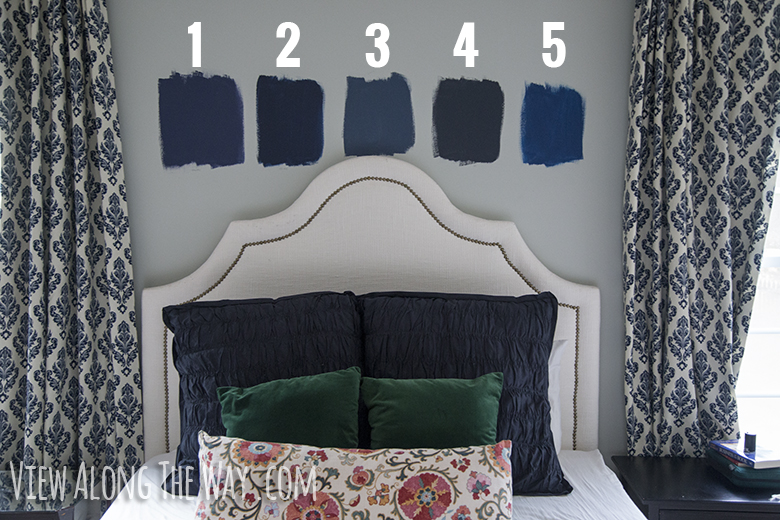
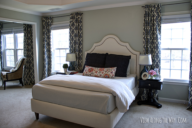
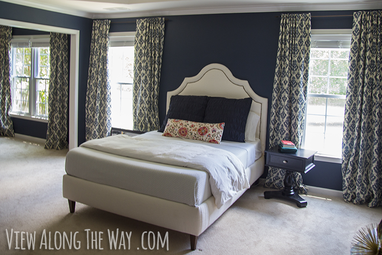
It’s #4, Benjamin Moore Hale Navy (HC-154) – the color that I was most drawn to in the last post and the color that you all voted for the most in our little poll:

My major hesitation was a deep-rooted rebellious streak that wanted to not choose the color everyone else is choosing, since Hale Navy has been so popular lately. Nothing is worse than being predictable, right?! (If I were auditioning for a trashy reality show, I’d emphasize this part of my personality during the audition process.)
But dang, yall. It’s gorgeous. And sometimes the best one for you is the one that’s proven their goodness over time, the safe choice that you know you can count on.

Of course, I also said I didn’t want to use Hale Navy because I thought everyone else has already used it, so this analogy breaks down quickly and it’s probably best if we don’t take it much further. Erm, we should probably get back to the paint.
Here’s the thing: I have a 100 percent track record of hating every paint color I use at first. But then it grows on me and I stop hating my life. Or I actually continue to hate it and spend the next five years trying to convince Andy to let me near a paint chip again. But THIS? THIS was love at first sight.
I’m finding that the colors I love most in the end are not the colors I love on the paint chip or on the wall swatch. I have to choose the slightly grayer, slightly desaturated version of the color that looks right to me, and that’s how I know I’ll like it when all is said and done.
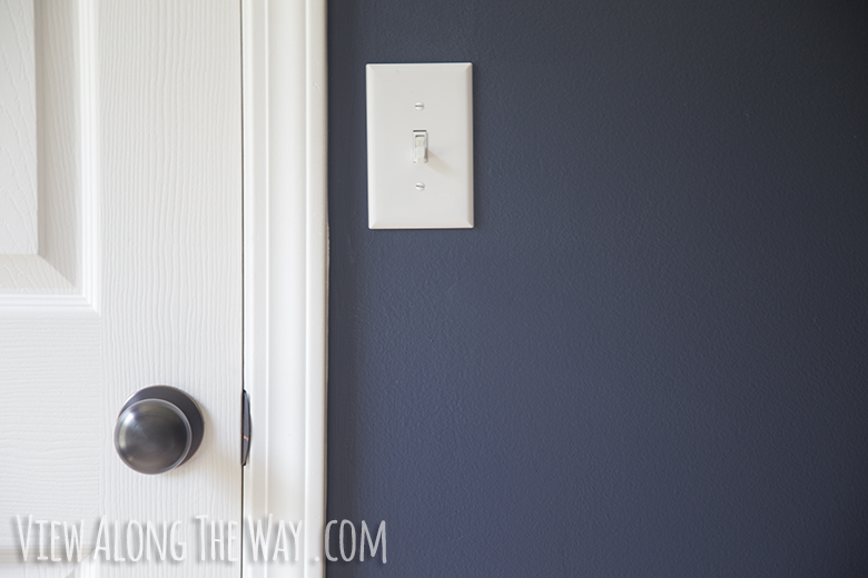
It does not look nearly as fabulous in these photos as it does in real life. Hale Navy (HC-154) is moody, complicated, serious, but you totally want to be its friend.
The paint itself was glorious, you guys. I used Benjamin Moore Aura interior paint in eggshell (although in retrospect I think flat would’ve been even better) and it went on LIKE BUTTA. So smooth. I thought we’d need three coats, easily, but the first coat covered so well that there was even debate about whether a second was necessary.
I’m sold on the value of the Aura paint. Done. It rocked. I wish I could go back and un-paint my closet so I could use the Aura paint. That project was a nightmare and, looking back, I’m pretty sure I used 46 coats of paint and lost at least 4 years of my life to painting those shelves.
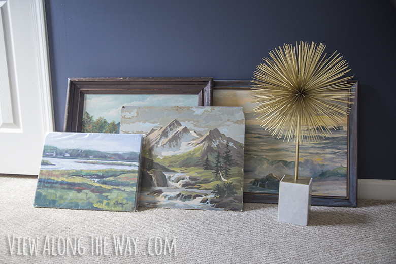
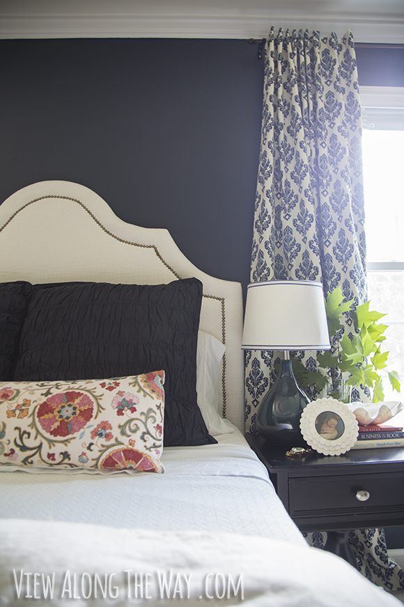
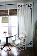
I’ve been collecting a few things for this room over time, and I’m super excited to get to decoratin’, because I love how they play with the navy:
And speaking of decorating, this room is NOWHERE CLOSE TO DONE. But here it is a little more put back together – curtains in place, bed made.
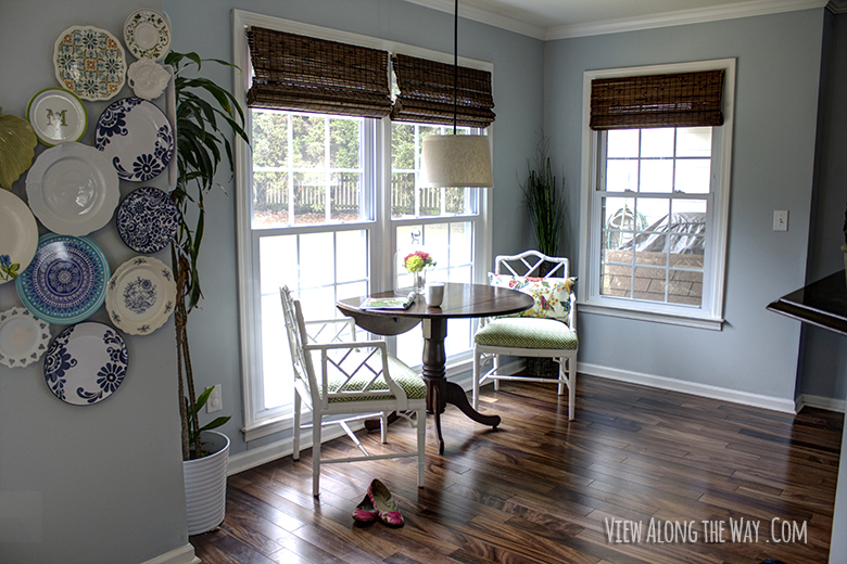
I think the navy is calling for a few tweaks to what I already have. I loved the way the room looked before we hung the curtains, so I’m considering swapping out the curtains for some simple wood blinds, like what I have in my breakfast nook:
Of course, the blackout curtains are incredibly functional in blocking out light so I can eek out a precious few more minutes of sleep at the crack-o-dawn when Weston wakes up. So that remains to be seen.
This is what still needs to be done:
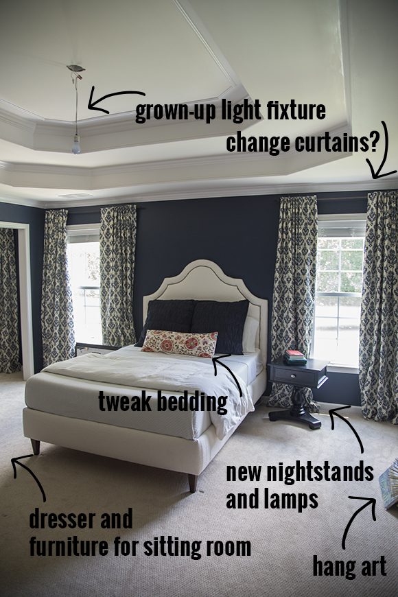
I’m definitely gaga for the way gold and warm wood plays with the navy, so I’ll be finding ways to incorporate that. I played around with some accessories I had laying around to see what pink looked like with the lumbar pillow.
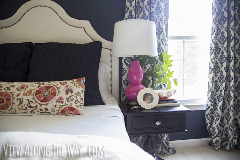
Don’t think that shade of pink is right. I tried the lamps from the guest room too:
I don’t think that’s it either, but it’s always fun to try things and see how they turn out. I’m still processing the room and deciding where to head next, but taking my cues from these things now, because I’m feelin’ the mood happening here.
But the good news is that I’m super duper in love with the paint color. FINALLY. We’ve been in the house for six years and this is the first time I’ve loved the color of our bedroom. (Thanks again for weighing in!)
I think the moral of the story here is this: just do what everyone else is doing, succumb to peer pressure every time and you’ll always be happy in the end. Right? 😉
This post is sponsored by Benjamin Moore, but all opinions are my own, as always!
 Hi, I'm Kelly. Glad you're here! This little blog is where I chronicle our efforts to fix up our beaten-down home on a tiny budget. We're not there yet, but here's a peek at the view along the way...


It looks amazing! Now you have me trying to figure out which of the rooms in my house I can paint Hale Navy! I think the curtains look great with the new color, too.
I too like the curtains, I think they are perfect, and add to the grown up feel of the room. More stately than the wood roll ups. I do agree that neither lamp seemed quite right. Maybe something with a gold shade? happy decorating!
it looks amazing!!! and aura is what we always use on our walls- it’s my favorite! self priming, low voc, goes on beautifully, and when it dries you don’t see where you rolled it ( i can’t stand that in low quality paints!)
Yay! The color is perfect! I love navy rooms…sometimes I miss my navy wall, but it wasn’t meant to be. Have to say…a little disappointed…no smoking jackets 😉 Maybe next time! xoxo
The curtains look fantastic with the new color. I think the curtains keep the room soft and romantic!
Where do you find those beautiful vintage landscape prints? I’ve been garage saleing all summer and NOTHING! Love the walls!
I’m a sucker for a dark moody wall! This looks so good! Like really good. Like it was always meant to be. Good choice lemming. 😉
Your bedroom looks fantastic!! I am a big advocate of using rich color on walls, and I think I am going to use the Hale Navy for my home office. Thanks for the inspiration!
GREAT CHOICE!!! I love the way your room is looking!! And the pink lamp….so much fun!
Your bedroom looks great! I’m ready to go paint something now! I’m the worlds worst at picking paint colors.
Wow that color is so pretty! And you have my dream bed! I love those kinds of headboards
Kelly, please keep the draperies! They look beautiful!! Add the wood blinds w/ the draperies. It looks fantastic and I am not usually a fan of dark colors.
Ooh dramatic! Love a deep, rich paint color.
Awwww…Hale Andy. What a man, even if he’s already been well used. Also, why in the world would you want to replace that light fixture? I’m pretty sure I just saw in House Beautiful. Gorg. Truth, though, the navy is pure fantastic. I LOOOOOOVE it against your light headboard and think wood blinds would be a great play of cool and warm.
i love the curtains too and would keep them!
So I think you inspired me to paint my own master Hale Navy. I’m not even kidding. lol
1. Curtains- I don’t think the bamboo is what you need. You need either an off white thick something or something in the gold greek key?
2. Lamps- that brushed brass or gold/bronze or whatever.
my 2 cents, lol. 🙂
Gold greek key?! That’s my love language.
LOVE Greek key!
Love it!!!! Usually the popular colors work for a reason;). I have found that in my own paint choices. Loving navy right now, and yours is fab!
I love it–the color, and the post. I get such a kick out of reading your blog; you killed me with Hale Navy, personified–perfect!!! Thanks for sharing!
You know I love hale navy and kind of wish I hadn’t painted over it in my master bedroom! Can’t wait to see what you do for accessories and such. Looks so good already!
I love it! You could always layer bamboo blinds under the curtains?
It looks beautiful!
I suggest you paint the two horizontal parts of your gorgeous ceiling navy as well.
The curtains look lovely, and I’m not a curtain person.
Lovely! I’ve been cravy (not a real word, but you know what I mean) for some navy lately too. I might have to get predictable with Hale Navy in Baby Jack’s room soon. I laughed at the comment about how everyone should have a blog cause I totally think the same thing everyday.
It looks so good! I was wondering if you considered painting the parts of ceiling below each of your crown molding in the tray ceiling, I think it would bring your eye up to your beautiful ceiling.
We have curtains and bamboo shades on just about every window in our house. During the day, the curtains add liveliness, the shades filter the light, I can raise them easily to let the kitties see out, and at night, when we want more privacy (bedroom, living room), I just close the curtains. The paint color you and the readers chose is beautiful, and you have wonderful taste in decor. Way to go!
Your room is gorgeous. I LOVE navy and white.
Your nightstands are very nice… if they are solid wood, have you considered stripping and staining them?
They’re not solid wood, or I’d be all over that! One is black pressed wood and one is mirrored, but it’s broken. 🙂 There’s no salvaging it!
LOVE it!
Looks gorgeous. I also love it without the curtains, I think! And um, hello amazing architectural ceiling of Kelly’s that I have never before seen. I would like to marry you. Have you considered popcorning said ceiling? Would make that bare bulb look amazing. 😉
Ooh! Nothing brings out a bare bulb like popcorn ceilings!
You guys crack me up
I’m with Team Curtains … as in they look great! Even better after the paint job. Do agree that you haven’t found your ideal lamp base yet. Always nice to have one little detail to fixate on…
LOVE THE CURTAINS with the wall color. Also, are some of those landscapes “Paint by Number”? I have two PBN of dogs in my lower level bath. They are kinda fun.
GORGEOUS! I painted us a focal wall of ‘Moroccan Blue’ (valspar pantone color) a few months ago, and I’m itching to paint the whole master that color – it’s ah-may-zing!
Here’s a thought. Those blue lamps sort of fade into the background right now, but, how about a gold-dipped treatment? Spray paint is my vewy bestest frwend! Oh, and Rub-n-Buff. Hold on, have to quell my 12-year-old-boy humor a bit. Ok, done.
The walls are absolutely stunning. I like the drapes, but also think the blinds with something visually lighter (gauze sheers maybe?) would frame out those awesome windows and really make them shine. And you totally need a blingy chandy. Just sayin. I can’t have one (hubby addicted to nasty ceiling fan), but you can!
LOVE IT! I would keep the curtains but only one panel per window. Left on the left window and right side for the right window and also add the woven blinds.
See, I knew I was right–it looks amazing! And I very much approve of the direction you’re going in with those paintings you’ve got collected there 🙂
Oh my gosh, I LOVE it!! That’s the perfect color! I love the idea of switching out the drapes; the photo without them up yet looks amazing. (And the wood blinds are pretty cool.) The white of the headboard just pops, but at the same time it’s still a neutral color and looks calming.
And I love how much space you have in there. I know we think space should be at least partially filled in with furniture and art, but sometimes a blank wall or a bare ten feet of carpet is just heaven.
I agree something’s not right with the curtains but I would personally never give up my blackouts in the bedroom! Maybe some gold and white curtains?
Came over from Benjamin Moore’s tweet. The wall color looks great, and the curtains do too! Vote for keeping them.
LOVE IT!! It looks gorgeous! How about a more orangey/salmon color for lamps? Or how about brass lamps? Either would really pretty with navy. I think your curtains look pretty, maybe put wooden blinds under them for a layered look. Even plain white curtains would be pretty with the wood blinds. Lookin’ good, girl!
It looks classy! What about gold for a lamp? And I live that spikey gold thing you showed. I’d probably stab myself on it tho if it were in our house 😉
keep the curtains! Add blinds if you want, but keep the curtains. They look fabulous.
I say change the curtains too. I like the white window frames too much next to the navy to cover them up.
Oh and I also love Aura paint. Never using anything else again.
That is simply the best paint color ever. I adore it. Cannot wait to see what you do with the remaining items in the room. Perhaps another amazing DIY light fixture…
GORGEOUS! It looks absolutely amazing! I’ve been wanting to paint our master bedroom a more dark, cozy color but I can’t get the hubby on board.
I LOVE the curtains. Granted they do contain a lot of fabric and maybe it is over kill in both the bedroom and sitting room, but I love them and would keep them in the bedroom at least. Maybe you can put blinds in the sitting room and reuse some of the curtain fabric for a throw pillow in that comfy chair and recover an ottoman. 🙂
PS Benjamin Moore corporate plant is just down the road from me and they donated over 50 gallons to my library when we were repainting our 40′ domed lobby. They are a great company.
What the hale, where did you get my moms mountain pictures?
This is really beautiful, Kelly! You’re tempting me to try the color on a piece of furniture for my bedroom…
It looks SO good! I am glad you chose your favorite. It looks better on the whole room than just the little swatch. I’m also so glad you said you like it better without the curtains. Me too. 🙂 What color is your trim? You may have mentioned this elsewhere, but thought I’d ask anyway. 😉
Thanks! It’s Benjamin Moore Atrium White.
That color is AMAZING!!!! Wow! It really is so so stunning!!
Love, love love it! Perfect color Kelly! The contrast between it and the headboard and white trim is ahhhmazing! (I am a contrast loving girl) I painted a dark blue in our guest bath that I considered repainting (nothing new!) …I love it now. But I know me. I’ll change it ..again..at some point! 😉
Looks fab…can’t wait to see it all done!
Nancy
So glad you went with what the Hale Navy!
Incidentally, I think the room looks good with the curtains, but would look fabulous if you also added the blinds. So blinds + curtains for texture and layers.
I’m adding my voice to the throng. Don’t take down the curtains. If you want to add wood blinds behind them, fine. But leave the curtains. They add drama.
Love the colour (European!) even though I didn’t vote for it! The finish looks super-professional, especially where it meets the white. I think the curtains need to go although I do like them having faithfully followed your instructions to make my own set!
Think the nightstands could stay though?
I love the color and I love the colors. I painted my library crime scene red. 6 coats. Love it. Searched for 6 years to find drapery fabric and finally found 44 yards of gold and Ruby silk velvet. $11/yard. Instead of pinch pleats, I did a goblet heading. Love it. No furniture in there, but I can both look and wait : )
Keep the curtains! But add the wood blinds, too. The best of both worlds!
LOVE the color. LOVE. And I am a huge fan of Aura too.
Wow! Perfect choice..it is stunning!
looks great! any plans to jazz up that fantastic tray ceiling??
So glad you found a color you love! It took us 3 years to find the color we preferred for most rooms in our house. We love it so much that when we moved, we decided not to search for a new color and went with that one all over again. I do agree you should search out some new curtains to add some more depth and contrast to the navy.
Paint the pink lamp shades something that would “go” more with the navy? Then pick up a different lamp shade if you don’t like those ones?
Love the navy paint. Love the white accents. Not crazy about the curtains – loved the room without them. If it were me, I’d go with white wooden blinds which fit inside the window frame, and do as many crisp white accents as I could get away with.
I love it! It’s beautiful! I’ve been toying with going with navy in our master too, and now, after seeing how beautiful it is in your home, I think it needs to be bumped up the to do list! 🙂
If you end up not using the curtains you could give them to me (ok or sell them, it was worth a try)! I love them and I equally love your Hale Navy Bedroom walls. Hmmm, what will I paint Hale Navy??
Love the color – and love the drapes with the new paint!!! Don’t switch them out – they look great!
I love the colour and I love the curtains! Don’t change them! I actually used your lined curtains tutorial this weekend to make drapes for my living room. 🙂
Yay! I hope they work as well for you as ours do for us!
Kelly, I LOVE your new bedroom color. I am a HUGE fan of navy blue. I had a sunroom in my old house that I painted navy blue and it is still one of my favorite rooms ever. Navy blue + white trim = YES PLEASE! Great choice! Can’t wait to see what else you chose for the room. Love the accessories that you have chosen to set the mood.
LOVE it!! I am obsessed with blue, myself. Every room in my house has some sort of blue in it. I have done a lot of remodeling and decorating and DIY-ing and many of the things I did included the dark blue color and a blue DIY striped rug. Only recently did I get into the blog world and it seems like EVERYONE has dark blue something and striped or chevron rugs or white subway tiled kitchens (which I swear I thought I was so unique for having -__-)! I’m all for being up to date, but I don’t want to be just trendy. So I feel you! lol Great job with your room and your house, everything is very beautiful!
P.S. If you have the chance, please check out my slowly, but surely transforming home! Thanks!!
http://ihavethisgreatidea.wordpress.com/
I love the color you chose for the walls. It looks great. One thing you may want to consider doing is painting your ceiling. You could paint just the bands (vertical areas) in Hale Navy or paint the flat area where your light fixture is in Hale Navy. It will bring the color up and make the room feel cozy. You could also go a shade or two lighter than the Hale Navy if you don’t want it that dark. It really would look good.
Love that idea! Thanks, Wendy!
Wow that room looks amazing – I love the headboard and the curtains. I have the very same ceiling in my bedroom and I am surprised you didn’t paint it along with the walls. I am curious as to why?…now I am wondering if I should or shouldn’t paint mine. I will be painting my bedroom in the next couple of weeks and I also always hate whatever color I buy as soon as I try it on the wall (I have about 6 gallons of dark gray paint in my garage). I would love to hear about the ceiling. 🙂
hey, just now I noticed the comment above mine mentioning the ceiling. Please paint it and post it for me to see…lol…you don’t mind being the guinni pig, I mean pioneer, do you?
That colour is awesome! Navy is one of my faves! I love all of your ideas on updates to finish off the room as well.
Picking colours is so difficult sometimes isn’t it? For me, it always seems like I end up with my original choice, and should have probably stopped looking at samples at that point.
I like that you go with the grayer version of the colour you originally picked – I much prefer muted tones over vibrant ones myself.
Can’t wait to see the completely finished room!
Love the makeover. The color of the paint is awesome. On another note Please tell me how you hang the plates on the wall in the breakfast nook.
Thanks! I posted about how we hung the plates here: http://viewalongway.wpengine.com/2011/05/a-plate-hanging-hack/
Best morale ever. Also that color is gorgeous. I want to marry it, but you already married it via marrying Andy if we continue with analogies. I’m so confused guys. Whatevs Hale Navy for the win. I also dig with pink lamp and the current fixture. What? That’s not a thing? Because yeah I’ve got some of those around here.
I freaking LOVE this!! Can you tell I’ve been a horrible blogger and have been basically MIA for a good portion of the summer in terms of my visits? Trying to do the catch up thing now but holy heck, yes, this is the bomb. xxx
Hi,
I stumbled across this on a link on Facebook. I don’t know how you feel about green, but I think the green of the plant on your night stand, and the greens in your paintings would look great with the navy and gold. If it were me, my curtains would be a pattern that was more than one or two colors so that any accessories you chose would fit, and you wouldn’t have to change the curtains every time you wanted an update. There’s my opinion…This was a great read and you have a lovely eye for color, though I kind of liked the bright pink with the navy as well. Good luck with your choices!!
Love ! Love! the curtains with the new paint color. If you really are wanting to use the wood blinds then use them w/curtains for a layered texture look.
The stars aligned: I got a business trip from London to NYC and was just ambling down an avenue when I came across a hardware store that sold BM paint. Went in and fully raided their chips!!!! Got them in my suitcase to match up to Farrow and Ball back home. RESULT! x x x
Hi! Awesome in Action!!! fantastic room =) — Lamps… DIY your own marble lamps with marble tiles. I am sure I found a how-to on Pinterest. Here it is: http://www.pinterest.com/pin/22518066861430694/ (Cindy Briedis • 22 weeks ago
Make a Marble Lamp Base With Tile from Houzz. Get a lamp base that looks high end but costs only around $20, using basic tools and easy-to-find material… -CAB)
It’s beautiful! And wel duh, I just saw this post. I’m late to the party.
Hi, can I ask you what the recipe for hale navy on top of your can reads? I just spent a fortune on hale navy and it looks nothing like the navy blue on your walls! It looks so gray when I use mine that I’m convinced that they mixed it wrong at the store! If possible can you take a pic to send to my email address?
I’m sorry – I don’t have the can anymore!
I painted a wall in my dining room, plus the adjacent hallway, Hale Navy a couple years ago and I have loved it! I was nervous about such a bold color but it is awesome!
I just saw this post and had to comment. First of all I LOVE the color! Blues are my fav! Second, I had a Hale Navy swatch years ago for my front doorvto match a previously painted door the former owners had painted. Loved the pureness of the navy color then and love it more now on your walls! Now I must find a place for it in my home since my blue doors are gone…..
I like the curtains too, I think the room needs a third bit of blue- like a blue or blue and white tossed blanket on the foot of the bed, or blue plaid or blue flowered but something blue on the bed. to balance out the blue Large pillow and the white spread. I got to your site because I have painted my bathroom a symphony blue- to match a shower curtain from Marimmekko that is green, blue and white. I think that I have the right blue, but, it seems to bright. My husband read that adding burnt sienna, or orange, to the blue, will shock it down some. Make it still match but not be so intense. I hope it will grey it down some. But does anyone know what to do?
Hi Kelly. I am in love with your Hale Navy choice! I have already painted my walls , hung my drapes and purchased white new night stands ( not to mention having the floors refinished, new white closets installed, we removed the old closet , white trim on the baseboards and windows. All this work to gain a master bedroom that still measures 15×12. Small Rambler Love. Everything has shades of grey or white . Walls, bedding, drapes , rug ( i won’t cover those beautiful wood floors until its cold). Call me crazy, but I am seriously considering painting a 1970s swirly half fake wood headboard Hale Navy! I wonder what your thoughts are? I cannot purchase this fabulous color in a spray paint so I would have to paint it by hand with a brush. Am I crazy to use such a bold color on a headboard ? Should I use it on something smaller like a frame or small chair? I love your blog and your sence of style. I would really appreciate any thoughts you might have. Enjoy your 4th of July holiday . Thanks for inspiring us all.