Hey hey! Check out my pretty new site, friends! If you’re checking in via RSS or email, you are officially invited to hop on over and check out the new look.
(Quick warning: There are still some kinks! It might take a couple days to work ’em all out.)

Have you ever left the house in an outfit, only to realize soon after that the outfit DOES NOT WORK? In fact, you’re quite certain you look like a giant turd? That’s how I’ve felt about my blog’s look for a long, LONG time. We’ve had this little bloggy redesign in the works for months and in the meantime, I didn’t want anyone to look at the design or layout, I inwardly cringed every time it loaded, and I was SO anxious to get it redesigned.
My number one goal was to make the whole site easier for you to navigate, faster, and a generally better, less turd-like experience. The plan was:
- Make the content area wider so the pics can be much bigger.
- Make it easier to locate the social media buttons so you and I can connect more easily on facebook, pinterest, etc.
- Add a couple new pages (more on this in a sec!)
- Make it feel a little more “me.”
- Make it easier to browse on your phone or tablet.
Finally, my dear sweet, handsome, muscular, rugged husband spent a large chunk of his winter break helping me get this guy up and running.

We did the whole redesign, top to bottom, on our own with the ever-present help of google and photoshop, with the end goal of making the site a better experience for you guys. Mind if I show you around a bit?
Design Elements
First, let’s talk design ’cause that’s fun. I thought a bit about the characteristics of me and my blog and I arrived at this: I am not tailored. I am not perfection. I am messy. Informal. Imperfect. I’m about easy shortcuts and fingerprints on the window. I am hand-drawn, watercolor, coloring-outside-the-lines.
But I still wanted this to feel like the VATW you’ve seen before, so I kept the same shape logo and applied a watercolor brush to it.
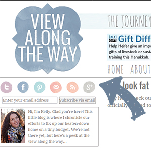
If you look at the top left of the site, you’ll see those pretty little watercolor social media buttons. They inspired the color palette.
We cranked up the font size and the content area so now the pics are ginormous. Because you WANTED my big ugly mug magnified IN YOUR FACE, right? RIGHT?!
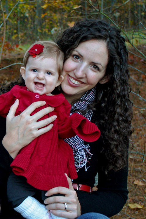
Actually I think this’ll make it better to see detail in my tutorial posts, and as an added bonus, you guys can more clearly see the fingerprints and dog hair in my home. You’re welcome for that.
New Pages & Features
Project Gallery
A couple months ago, I quietly rolled out a new project gallery, so we could all find past projects more easily. Honestly, it was as much for me as anyone: I couldn’t find any old posts I was looking for either, so I always sympathized when people emailed me asking for a link to one tutorial or another.
Now, you can access that project gallery quickly and easily right at the top of the page. See there?

All my past projects and tutorials are nicely organized for you there. It’s made it so much easier for ME to find my old posts too!
Shop

For a long time, Andy and I have wanted to open a shop to sell some things we’ve been creating. I’ve gotten some requests and emails asking if we’d sell some things and I always thought it sounded fun to have someone else to create for! Right now, you can click on my “shop” page and see my amazon store, which we’re working on populating with tools we personally use, gorgeous fabrics we’ve used or would use in a heartbeat, and some other home items we can happily recommend. We’ve even included some of our favorite safe, non-toxic products for the kiddos.
I’ll keep you guys updated as we get ready to officially launch the Shop at View Along the Way. Just typing this out has me SUPER pumped to get it going!
Search
We also added a google custom search button at the very tippy-top of the page. If you don’t see what you’re looking for in the project gallery, or just want to search for all mentions of “turd” in my past posts, type your search term there, and SHAZAM: google search result magic.
Easy email subscribing
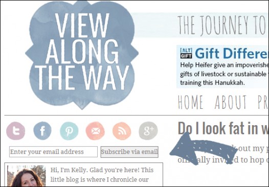
Just under the social media buttons on the top left, we added a little box where you can enter your email address and have all new posts sent right to your inbox. Totally free, natch.
More to come
I’m still planning to make some changes to my house tour and “about” pages, so that’s coming soon. The link to follow me on G+ isn’t correct yet either.
But I need your help and opinions!
If there’s anything about the site that seems wonky or doesn’t look right, or you generally detest it/are confused by it, please drop me a line and let me know! This site is a work in progress, and it’s always hard to know what we might be missing or what might seem unclear. That said, things might seem a little weird here for a while as we work out the kinks.
Moral of the story
I hope this redesign makes hanging out here a better, more pleasant experience for you, because I’m so grateful you take the time to stop by. Like, disgustingly, can’t-be-overstated grateful. Have a fantastic week, friends!
P.S.: Don’t forget to enter the Silhouette giveaway!
 Hi, I'm Kelly. Glad you're here! This little blog is where I chronicle our efforts to fix up our beaten-down home on a tiny budget. We're not there yet, but here's a peek at the view along the way...

Yeah for a new look! I think I like it. Give me a few more visits and I’m sure I’ll LOVE it. I especially love the color palate and the bigger pictures of YOU (I mean, Mila)!!!
i love the new look, but that photo of you and mila- LOVE that!!!
Looks great Kelly! I love it! 🙂
Love it! I’ve been working on a redesign of my blog too – man it’s TIME CONSUMING! Staring at HTML all night long is like going down a deep dark rabbit hole….at least there is light at the end of the tunnel (and coffee and chocolate…). Your site looks fantastic, love your new social media buttons.
It looks lovely. It looks like the internet version of you. You know, the only one I know.
I liked the old look and I also really like the new one, I think whatever look you have would be fab except for maybe a brown turd or something like that. Yeah for handy hubbies who can help with blogs and DIY, we both scored well on that didn’t we?
I think the redesign really gives your site a boost! Like it, ps I will trade you cat hair for dog hair.
I generally am that way with photos… I think I look like hot stuff and then I look at photos and realize that I am, in fact, a giant turd. haha 🙂
Love the redesign. Everything feels much bigger and brighter and I especially love the social media buttons!
If that is your fat look with watercolors, please paint me up Andy!
Bliss
It looks B-E-A-Utiful! I love the new watercolor logo and the larger photos. Great job guys 🙂
LOVE the new look! I like how much white space there is — it feels very clean 🙂
Congratulations on the new look guys. It’s a great way to start the new year. Fresh and fun, just like you!!
It looks great! I just redid mine too… new year, new look! 🙂
Love the water colour look! I am in the midst of a redesign too and man- does it ever suck up the time! You did a great job!
I think it’s amazing. Like…amazing! Love the wider design, the soft colors…the ginormous pictures!! You done good.
Clap clap clap! Looks GREAT!!! I have been jonesin for a new look… your site looks AMAZING!!!
Everything looks great! I love the new layout!
It looks amazing, Kelly!!! Just amazing!
YAY!!!! I’m so pleased for you and the redesign is the DOG’S BOLLOCKS (as they say here – it means ‘a very good and delightful thing’)!! Your hubby is a keeper, I tell ya and I’m all kinds of jealous. I so need a redesign of my blog as well and I love yours. Great job, seriously. *stands up and applauds* and seeing your pretty smiling face in HD is lovely. I’m a little jealous of your pretty face too. So there. xxx
Awesome Kelly….looks great! And all the new features are great too! 🙂
Nancy
Love the watercolor! It looks great.The links at the top aren’t showing up correctly. I’m using safari if that helps. I love the font you used for them in the project/shop section of this post. Simple and beautiful!
This page looks quite appealing!!
It’s gorg, Kelly and Andy!! Awesome job – you are so talented!! I have tooled around with my blog for over two years, and have recently come to the conclusion that I can’t be good at everything. I am so impressed that you did this whole beautification on your own! Love it!
Oh I love the watercolor – all elegant in it’s imperfection. It does seem fitting for you 🙂 And the hand lettered look of the subheading font is a nice complement. I dig. Kudos and congrats to you and Andy for doing this DIY style. (As if you’d do it any other way.) Definitely looking forward to more about the shop. Very exciting!
Love the new design, lady! Bigger photos are always better. I feel the same way about pieces of birthday cake. The new logo is great too! I really need to step up my WordPress coding game. It’s just so hard to figure out.
I sure wish you hadn’t displayed such a huge picture of yourself. Now I have HAIR ENVY! I wanna see some FLAWS! Gummed a ZIT!
Haha. The pictures are not QUITE big enough to show off those gray hairs that keep showing up more and more. And thank you photoshop for the zit removal!
Love the new watercolor look and the enlarged font and photos!! Exciting changes, my friend — good for you! I’ve been itching to do a little updating, too, but now that I’m back teaching, it’ll have to wait until summer. 😉
xo Heidi
Looks great Kelly!! Oh, and Andy too! : )
You crack me up! It looks great! Watercolor suits you. You definitely do not look fat, lol.
Kelly! It is beyond amazing! LOVE it! Congratulations! It’s just beautiful! Just registered for Haven Conference. Will you be there? I’d love to meet you. Happy New Year! 😀
Looks fantastic, pal!
Something must be in the (blog) air… because I just redid mine, too!
It looks great. This is my first time stopping by and I love your house… can’t wait to swing by more often.
Love the new look. It’s so airy and fresh. It’s so nice with a new look for the new year, isn’t it?
I love the new look! And please, you and Mila are beautiful!!
It’s just lovely, Kelly! I love the soft-modern feel you have…the larger font and the openness of it all! Way to go!!!
I just love it, my friend! You look fabulous in watercolors and pastels. Truly suits you!
🙂 Linda
P.S. I bought some baskets from Target online and they arrived yesterday and look just so bright and new and BLONDE. So I Googled how to stain baskets and, shazam, found myself on your blog. So you may soon see a blog post on my blog on how to stain wicker baskets … with a credit to you, of course!
The site looks great Kelly! I always loved the old one too, but I dont think you’d ever make it look like a turd.
kelly,
I love the new look! Watercolor is so you! The font you are using is really pretty, too and I like the sidebar on the other side!
You go girl!
blessings,
karianne
L – O – V – E – L – Y site! Beyond this, a wonderful Family!
Girl, you rock!! Oxo from Brazil
Man, I’m so glad I dug through some of your older posts to find this one. As I mentioned before, I’m in the middle of a redesign myself (though I hired someone to help me because I’m not the graphic designer in real life like I am in my dreams). But the cool thing is that my new design has some similar elements to yours…like the watercolor! I totally have elements of that, so I’m sure that’s why I was initially so drawn to “View Along the Way.” Also, I’ll have to bookmark this post and write up something similar for my readers once I make the migration. I’m not only re-designing but migrating from wordpress.com to wordpress.org and changing my url. Fun times. But I think it’ll be SO worth the effort in the end. It seems like that was the case for you. Looks fab!