(I know I still have much to tell you about Jill’s makeover! We’ll return to that shortly. First I need help making a decision so I can move forward with other things in the meantime. Stay tuned!)
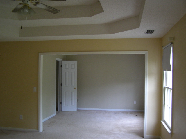
When we first visited our house to consider buying it, Andy and I both felt that the master bedroom was kind of outrageously large. We actually thought it was a giant waste of space, and therefore a major downside to the house. What are we supposed to do with an adjoining sitting room for goodness sakes?! Have tea parties? Play bridge? Lounge in velvet robes?
Answer: YES. That’s basically all we do most days.
My well-thought-out, not-at-all-accidental remedy for the size problem has been to repaint the master bedroom approximately 47 different times, laying on enough coats of paint to slowly close in the walls on all sides and reduce the room to nearly half its original size.
Andy’s maybe not such a big fan of this plan.
The problem was that I didn’t have a clear vision for the room, and I made the One Major Design Mistake That Makes Decorating Harder. (Read it here. Are you guilty too?)
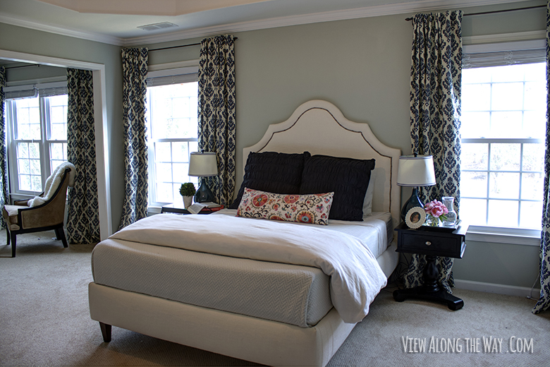
This gray-green is where we sit today. (It’s Benjamin Moore Silver Sage.)
I chose it before I even knew what I was doing in this room, because I thought you’re supposed to choose paint colors first, because I was a silly little goat and wanted my life to be harder than necessary.
As a result, we’ve stalled out on decorating in this room for years.
Well: that’s enough of that! It’s time to fix this room once and for all, make it beautiful and livable and fix all the things we’ve just been living with. Like a bare hanging lightbulb, broken nightstands and no storage.
We built the upholstered bed (see how to do that here), sewed the curtains (tutorial here) and finally kind of settled on the bedding. Now that we have a design direction and a lead fabric (the lumbar pillow) I’m finally at the right point in the process to be allowed to go near the paint swatches. I have enough information to make an informed paint color decision, without repainting for the 49th time.
I mean, I hope.
We only use this room in the evenings – aside from tea parties and cigar-smoking-while-robe-wearing of course – so I want to go darker and cozier. I want to go navy.
I think it’ll tie in the curtains and the bedding, and increase the drama factor by a hundred and six. Or, it’ll just make the room a little bit smaller and I’ll repaint it again. Either way, a win, right?
Here’s where you come in: I needs the helps, friends. On the scale of life’s most important decisions, this ranks. (IF I GET THIS WRONG, ANDY WILL NEVER LET ME NEAR A PAINT SWATCH AGAIN!!)
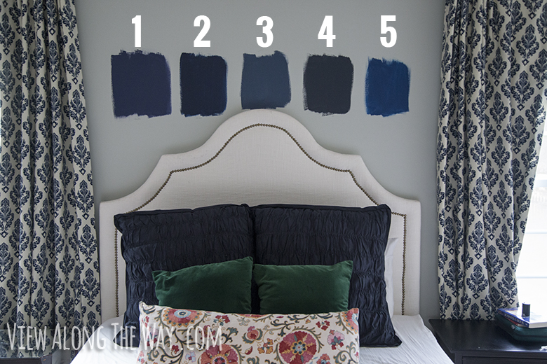

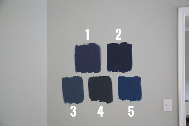
Here’s what you’re lookin’ at.
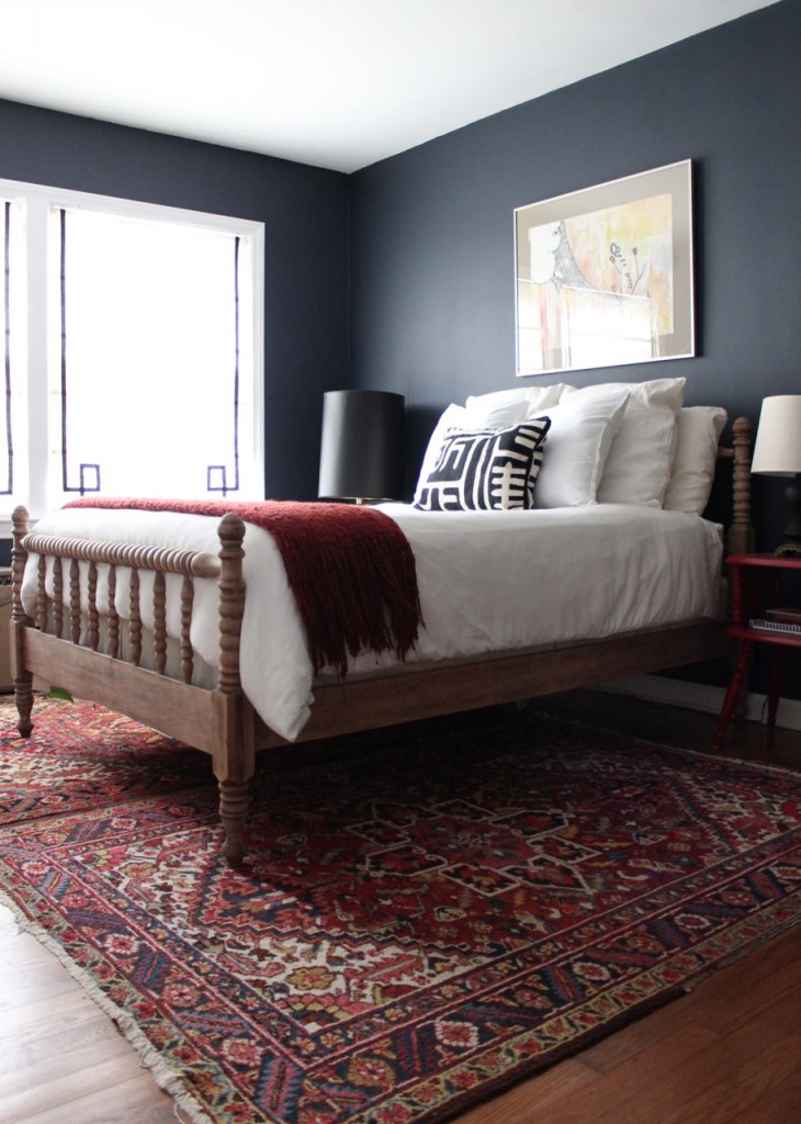
1 — Benjamin Moore Stunning (826): It reads the most purple of all the choices, which makes me nervous. However, a deep purply-blue could be kind of amazing. This is Benjamin Moore Stunning in action:
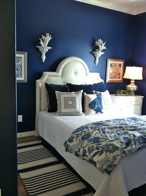
It doesn’t look nearly as purple in that photo, does it? It looks like a powerful, happy blue. Do the swatches deceive me?!
2 — Benjamin Moore Old Navy (2063-10)/b>: This is a strong contender. It feels clean, classic and nautical. Plus it’s the color Amber and Nick at Wills Casa painted their island, and I kind of want to steal their entire kitchen and wear it as my skin. WHY IS IT SO AMAZING?!
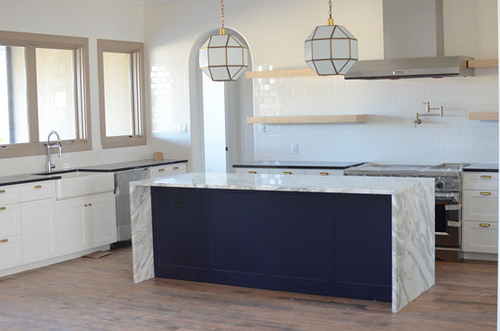
PS: If you’re not reading their blog, your life is incomplete.
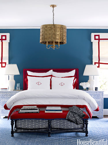
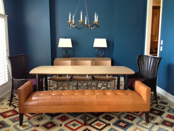
3 — Benjamin Moore Van Deusen Blue (HC-156): Not it. It’s a little softer and lighter than I want, but it’s a gorgeous blue, if you’re looking for one for your house. Here’s some Van Deusen goodness:
4 — Benjamin Moore Hale Navy (HC-154): I’m trying SO HARD not to like this color. It seems like lately, everyone and their moms are painting things Hale Navy and I cannot succumb to paint-color-peer-pressure-and-predictability. I can’t use Hale Navy on principle, right? The problem, of course, is that it’s kinda beautiful. It’s grayed-out enough so that I think when the whole wall is covered, it won’t be overpoweringly bright or obnoxious.
Behold:
It’s annoyingly perfect, isn’t it? ARRRGH.
5 — Benjamin Moore Downpour Blue (2063-20)
Definitely too green for what I want, but it’s an incredible color. I want to find a place for this color somewhere else in my house though. See?:
It’s halfway between navy and peacock teal, which is a fine place to dwell.
The fabulous people at Benjamin Moore are sending me their fancy Aura interior paint for this room, which I’m super pumped to try out. It also means I need to make a quick decision and probably not live with random paint swatches on my wall for six months.
So tell me: what color is your fave? Should I resist the call of the Hale Navy on principle? Go with the classic, clean Old Navy? Take a chance on Stunning? Let’s take a little poll, just for kicks! (If you’re reading this post through a reader or through email, you’ll probably need to click over to participate. Your vote counts. Let your voice be heard! …and other election-year cliches.)
UPDATE: Click here to see what color we chose!
 Hi, I'm Kelly. Glad you're here! This little blog is where I chronicle our efforts to fix up our beaten-down home on a tiny budget. We're not there yet, but here's a peek at the view along the way...


I LOVE Stunning! It was my pick, even before scrolling to see the whole room shots of the colors. Hale Navy is beautiful, but Stunning seems to have a little more life in it while staying dark and dramatic.
So I really wanted to read this because we just painted our den a benjamin moore navy. I LOVE that I got to pick a swatch color on your photo before I knew what I was looking at. Of course, I picked hale navy. Of course, that’s what I just painted my den. Just like everyone else. Of course.
But I swear there is a reason. It’s the perfect navy. We’re doing our room all moody and masculine and mens smoking lounge-ish. It’s perfect. My neighbor used it in her entry paired with bright turquoise and it’s fresh and boho preppy. My friend used in her guest room and it’s nautical and classic. See? It works with everyone and everything. Just do it.
i voted option 2- i think it’s deep and dark, but not too gray (i think the hale navy is too gray!). we have navy walls in our bedroom and it was one of the best color choices in this house- it’s so cozy and serene but also so chic!
Some inspiration for you below…I know, it´s not a bedroom but those blue walls in Kimberly´s dining room! She used dulux wildwater 1
http://www.swoonworthy.co.uk/
Old Navy. Hands down. I mean, if Wills Casa is doing it you know it must be super stylish. And it’s actually my real choice from your swatches. Fancy all around!
My vote is based entirely on your swatches pics. So if the color is off on my iPad, I claim foul.
Hale Navy was my choice as soon as I saw the swatches. Don’t avoid it just because others use it, only dedicated bloggers might recognize it. A lot of people like it because it’s a great colour, that simple 🙂
I vote for stunning. Here’s a thought, paint the bedroom one shade and the smaller room a shade lighter. White trim looks wonderful with navy. At one time we lived in a house that had a large kitchen and I painted it navy. I never had a regret or got tired of the color. Good luck, I know paint can be tricky. It’s hard to tell in a picture but just make sure it blends with your curtains.
We just painted our little bathroom Hale Navy and I immediately felt like I’d sold out to the man… albeit a sexy, velvety, gray-navy man that makes my little bathroom scream HEY! I’M DRAMATIC AS HECK OVER HERE!… so maybe it’s worth it to just go with what you like.
Stunning! The name says it all, right?
I voted for Old Navy because I feel that shade would look fabulous in your room. But I think if you really love the Hale Navy, I say go for it. I’m a firm believer in choosing what you love regardless of current trends.
Doing something you’re not passionate about just because everyone else is would be bad, but not doing something you love just because everyone else is would be worse! Who cares if you’re on the bandwagon if it’s awesome? Go Hale Navy! 😉
Of course, this is not all that easy considering we aren’t in the room with the glow from your gorgeous face lighting up the place. Too much? Okay, 1 or 2 is my through the PC montitor pick. I think 5 is way too royal blue. 4 is too matchy with your pillows and curtains. 1 is my first pic, but after reading your comments about it being purple that made me frown. I’m not a purple fan. So it got bumped to 2nd place. Can’t wait to see what you pick!
Love navy — I just painted my living room navy and we used Benjamin Moore Steel Wool. I was terrified at first because it seemed super dark, but against the white moldings, it’s gorgeous. It’s similar to Hale Navy but with more gray? Maybe? I’m obviously partial to that one, which is not a choice… sorry for going off the radar. I just thought you needed more options to shake things up. Love your blog. I never comment, so you know I MUST be passionate about this color. 🙂
Okay … I just googled pictures of it and you’re going to look at them and say, “Um. Lady. That’s not navy.” All the pictures look gray. BUT I swear. I’m looking at it RIGHT NOW. Don’t call me a liar.
WAIT! At the risk of sounding like a party pooper, before you paint such a large room any shade of navy, please consider at least two things – the vastness of that space and the quality of the light. I’m really glad you tried some paint on the walls, but before choosing your favorite, try a good sized swatch of color on each wall. Light really changes color, and you might not be happy with how your favorite looks on all the walls. Sometimes an accent wall of a deep dramatic color is all you really need. If you’re trying to use color to shrink the look of all that space, another option would be to dedicate sections of your master to different uses, much as you created different seating areas in Jill’s living room. Perhaps use that seating alcove as a library, or entertainment area, an upstairs laundry or even -dare I say it? – a decadent closet? Or, if it’s next to a smaller bedroom, adding it to *that* bedroom’s closet space? We know people who added a pool table to their alcove. (No kids! Lol) whatever you do, I know it will look amazing since you have a great eye and you never quit until it works. Best of luck with your project!
I voted Stunning because I really want to see it in your room. I think your draperies are leaning in to that swatch just a bit because they love it too! Really though, I think either Stunning or Old Navy will make your drapery fabric sparkle. I’d be concerned that Hale Navy would read as gray with the navy-patterned fabric. Can’t wait to see what you do.
Totally agree with this comment! Although, Hale Navy would work I agree it’ll look too gray. Stunning for the win!
Give one more to Hale and take away one from Downpour, I accidentally clicked 5 instead of 4. You know I’m bad at math.
Quick observation… We are house hunting and the number of hideously painted rooms I have seen is unbelievable. If it was up to me, I would steer clear of anything on the “bright” side because those colors look dated much sooner than the understated colors. (I liked 4.)
Ack! I was going to say 2 or 4 just from the paint samples on the wall and then you made a poll and made me choose JUST ONE?! WHYYYYYYYYY?
Also, I am glad I’m not the only one who balks at a choice just because it feels too common and predictable. But I STILL voted Hale Navy. But only because you twisted my arm in a poll.
“Hale Navy, full of grace…”
Just because a lot of bloggers might use Hale Navy doesn’t mean that everyone in real life is using it. You have to go with what you love and what looks best in your own home in your real life. It’s easy to forget when you’re a blogger and/or a reader and immersed in home decorating that most people aren’t, and people who visit your home or future buyers of your home will have no idea what that color is or who else has used it.
On your wall, I liked #1 and #4 the best, but when you showed pictures of other rooms in those colors, #4 is definitely the best!
Old Navy! I just painted our front and back doors that colour and I love it! (There are pics on my blog if you want to see the colour)
Ok, where’s the photo with that inspiration pillow tacked to the wall between your two favorite colors? Because THAT would totally help me decide. I love both of your favorites, but would lean more towards the saturated navy – the grayed out one might begin to look really gray when other blues are put next to it.
I personally like the color that you have now. But if you are going to change, need something else besides the blue, that will make your curtains disappear
Technically I already weighed in on this choice in the real non committal way of voting for both Old Navy and Hale Navy. If painting Old Navy continues to make you say nice things about Wills Casa, then I absolutely (and unbiasedly) vote Old Navy. I will still vote Hale Navy as well because I want to be right….change of plans I vote for all 5. Guaranteed to win!
I know you have to pick a BM color on account of it being free and all.. but Emily Henderson swears by Hague Blue by Farrow and Ball and says it is her fave navy paint color. I’ve seen her use it a couple times and it is amazing. The perfect dark but not too dark, not too royal, not too green navy. She also has an older post on navy paint that is quite funny (http://stylebyemilyhenderson.com/blog/best-navy-blue-paint-inspired-by-robert-pattinson/) and she mentions both Hale Navy and Old Navy!
Just looking at the samples I instantly chose #1 (Stunning) and rightly named I might add. It isn’t garish or in your face, it sits back very sure of itself and knows it looks GREAT! I’m just thankful you didn’t (or hope you don’t) go with #3. That made me cringe 🙂 Can’t wait to see which one you pick and how it looks. I know whichever one you choose (please not #3) it’s going to look beautiful. And in the end, it’s really about what makes you smile and your heart be happy!
We just painted our bonus room Benjamin Moore Hudson Bay navy, and we love it! It’s a great shade of navy that you should check out. We brought home swatches/samples of a lot of your same navys and this one was perfect for our lighting. It played the most pure, neutral navy without being too dark.
Stunning grabbed me from the second I looked at the photo. Its name summed it up. I actually gasped when I saw the color. I think it’s just beautiful. My mother pained her similarly huge bedroom a peacockish/cobalt blue several years ago and it made such a dramatic change im the room. It felt moodier and more serene but happier somehow at the same time. We used an eggshell paint finish so it reflected more light around the room which kept it from feeling too cave-like. It didn’t look shiny, just like it had a subtle glow at night with the interior lights on.
I like Hale Navy, but if you don’t have a lot of natural light I would go one up on the paint chip. Lighting is key to me here. I think the Hale Navy is sultry and I like a sultry room. If there isn’t a ton of natural light throughout the day then maybe one up would read just as sultry and not be too dark. You do have a huge room. You could also enclose that seating space and have a giant walk in closet with a window, which would be my personal dream lol. Your home is beautiful and I think you have great taste. Whatever you choose I know you will make look beautiful. Can’t wait to see!
I think Stunning and Hale Navy would work very nicely. I recently painted a wall in BM’s Mysterious, part of their Affinity line of colors, and I absolutely love it. I think it’s very similar to Hale Navy in its richness and grey undertones and I have yet to see it anywhere else 😉
http://www.benjaminmoore.com/en-us/paint-color/mysterious
I voted Hale Navy because _I_ want to use it somewhere in my house! I already have Newburg Green in my (also stupidly big) master bedroom, which is The Most Beautiful Paint Color In The World, but too teal for what you’re looking for. I love a navy bedroom–exciting!
I am a big fan of #2 because it is similar to Farrow & Ball’s Black Blue, which I am majorly crushing on right now. 🙂
I really like Old Navy 🙂 I am supporting the Wills quest to go to your tea party 🙂
I also really like the Blue Coal that we painted in B’s room:
http://shiftctrlart.com/Blogpost/uo8p/Bs-tween-bedroom–the-reveal
That Hale Navy is pretty sweet too. It’s going to look stunning with that head board of yours!
I voted for Hale Navy because that is my favorite color. I love that color. I also like the Old Navy and that was my favorite until I saw the Hale Navy in the inspiration room. Actually, though while I think about it, the Old Navy looked better in your room I think. I dunno. I like both of those options!
Stunning is my pick. The other may be too dark esp if you are only in there at night. We used bm symphony blue in our tray ceiling and on the doors in our bedroom. Prob more blue than you want but very pretty.
I painted our MBR Benjamin Moore’s Indigo-go in Aura Matte. I LOVE it. Just to add another color.
I picked Old Navy because it seemed more of a true Navy to me. I know I’m definitely in the minority here (no offense intended), but I’m over all of the gray being used these days and that was a deciding factor.
Just be SURE you want your room this color. Take a look at all bedrooms you pinned to see if the dark navy is what you gravitate towards. I loved the Sherwin Williams “Naval” in every picture, so I painted my bathroom that color. Ummm. No. It’s like a cave in there now. Some people love dark bathrooms, but I took a look at the bathrooms I love on Pinterest, and all of them are super light and airy. What was I thinking, right? Now my husband won’t let me near the paint department until I am 1000% sure haha. I feel your pain.
I picked Old Navy, and here’s why: you seem to be favoring Hale Navy, and normally I would say to go with your gut, and if you love it, who cares if the trend changes? BUT…since you did ask for advice, I think the Hale Navy might look too close to black in some lights. So it might look a little gothic as opposed to cozy/moody.
I voted for Old Navy because I feel like it’s the most balanced of the navy swatches (not too purple, grey, green, etc.). I like Hale Navy as well but it reads almost black in some lights so it depends on whether or not you’d be ok with that for your bedroom!
Based entirely on your pic of the swatches on your wall, I think option 1, Stunning , is the best of the bunch for you.
Not to confuse the issue or anything, but I did note that your focus fabric doesn’t seem to have any navy in it, but it has a lot of that gorgeous green. What if you went British Racing Green or a deep Hunter Green instead? Just a passing thought. (My own bedroom is painted in something v similar to the final swatch you have that was too green for you, but it reads super blue on my walls.)
I love the dark blue. You could also make that space a BIG FANCY walk-in closet. Just a thought.
I love the current color because it draws attention to the lovely curtains and all the pretty accents in the room. When I saw the photo, I thought surely it was the “after” because it looks so light, fresh, and crisp.
These are all great blues. We have used Benjamin Moore Gentlemen’s gray in our house and really love it. It has a hint of peacock in it so it’s not a true navy blue but just wonderful!
This is gonna sound crazy but our master was exactly the same, and we also painted it navy! Soooo, this was how we addressed some of your points:
1) The ‘sitting room’ became our grand master closet! Yup, I’m not throwing out ANYTHING! =)
2) The smaller closet then became our new laundry room. The laundry was in the basement of the house when we moved in and the bedrooms on the third. Yeah, easy decision for us.
3) Paint colors…I actually bought a few swatches and Behr’s ‘Distance’ won and I am SO glad it did. It’s a cross between numbers 2 and 3 (or 3 and 4). Dark enough to be moody but not dark enough to look black when the room isn’t well-lit. I absolutely love it. I never had a master bedroom this size or with this arrangement so I did a lot of research before we even bought the place so I knew EXACTLY what I wanted the second I got in that baby (yes, that’s how I’m referring to my master bedroom/closet! And what!? )
Whatever you choose, I know it’s gonna rock. Just thought it may help to share how we found our ‘happy spot’ with the space/colors we ended up with. Good luck!!!
I can DM some pics of our space if it helps…
STUNNING. It’s lovely. End of story.
Old Navy. It gives you a bit more blue than Hale Navy which is so grayed out. (and gives you a better depth with the curtains/accents you have going on)
My mom has a true navy bedroom. You will love it. I have to tell you that if your room is huge it won’t make it feel smaller, but it does feel less cavernous.
I painted my son’s bedroom navy because it does feel so much calmer and cozy at night. He is up all the time and the more I can subtly say “Go back to sleeeeeeeep” the better.
I cast my vote for Old Navy only because it’s such a classic and I get a rebellious streak a mile wide when I hear everyone’s doing something. But, Hale Navy is so pretty. To complicate things, I’ll just throw in that my husband and I painted our living room Benjamin Moore’s Blue Heron (we have 10 foot ceilings with white molding at the 9 foot mark and big windows to be able to go dark) and we love it. So I’m a little biased, but when I hear Benjamin Moore dark blue, I get super stoked on Blue Heron.
Starless Night by Behr. I painted my office this color and it is just beautiful.
In those photos, hale navy almost looks like a dark gray- not blue (I know it is blue- but I just don’t like it). I voted for #2. It’s deep and dark yet BLUE. Love me some navy! I’m painting a half bath &ceiling navy (it’s half white wainscoting so I hope the white really feels crisp and the navy makes it moody). 🙂
We went navy/charcoal in our bedroom (antique tin by Behr) and it is the best paint decision I’ve made. Any of the swatches you picked will look awesome, I’m excited to see what you choose!
I would totally go with Stunning. It really pulls the blues out of your fabrics. What are you going to do on the ceiling? Have you thought about painting to really pull out all the molding and make it pop? I would take your navy paint and mix a 1:3 ratio with one part Stunning and 3 parts white. Just a thought.
Props for going bold and dark in the bedroom. Seeing as how bedrooms are for cozy sleeping, if you can’t go with a dark paint color there, well, where can you? WHERE I ASK YOU. And I think the reason the Hale Navy is so popular is because it’s like a classic sheath LBD; it can be dressed up or down, it looks good on rooms of all shapes and sizes, and it’s content to just be elegantly in the background, anchoring the lead fabric, instead of demanding all the attention like some paint colors (*koff koff* RED).
Go with Old Navy. It’s just about the color of our room now, and I love it. Not too green, not too purple. Perfect.
Old Navy or Hale Navy!
Well, whatever color you end up choosing…I think when you do the big reveal a photo of you and Andy sitting in your smoking robes is pretty much required.
Love that idea!
I couldn’t settle on a BM navy so I went with SW Commodore. It’s the best for my lighting and space, I found the hale navy and old navy to be too grayed out for my kitchen. It’s so interesting how different shades of color can be from one another!
We just painted our bedroom a navy similar to Old Navy and we LOVE it. We were also inspired by the rush of recent photos of Hale but managed to resist its siren song. 🙂 Your room will look great no matter what you choose! Excited to see the results!
I painted my guest bathroom Benjamin Moore’s Mysterious. It was a complete impulse purchase and it was the best one I ever made (other than a shower stool but that wasn’t an impulse and my broken foot thanks me). I get so many compliments on it. Whatever you decide, I’m sure it will be lovely. Good Luck!
I painted my dining room walls Benjamin Moore’s Polo Blue and painted the trim white. It’s a very classic, black/blue that won’t look nautical. I receive compliments on the color constantly. It’s my favorite room in the house! Looking forward to seeing your choice of color. I’m sure it will be amazing!
If you were going to paint the room Hale Navy because everyone else did, that’d be wrong. Equally, not painting your room a color you love because it’s popular would also be wrong. Go for it!
Well, based on the photos of the swatches in your room, I had already picked #3 before reading any of your comments. So… I think you should go with that one. Here’s why… 2 and 4 are too dark. 5 is too royal blue, and 1 is too the opposite of khaki (you know, like for my kids’ school uniform pants… they have khaki and they have navy. That navy is the same as their pants, and it’s the opposite of khaki). Anyway, 3 is my choice. It looks light in the sample photo, but it looks great in YOUR room, and that’s what counts. It’s rich and maybe a bit mesoteric, which I like. 🙂
I love #4 and I think some others may have already said this but if you go with navy walls I’m wondering if your current curtains are going to look all wrong. Would a gray look better? I do love the navy idea though and can’t wait to see what you do! 🙂
I have a dark navy almost black bedroom and it’s the best decision I EVER MADE. The color changes constantly in the different types of light in the room throughout the day.
As for that extra space, I envision a nice getaway/quiet space. Gas/gel/faux fireplace (whichever is feasible), real comfy, chairs, definitely one being a plush chaise (or two), big basket for throws, end table, some book shelves with favs to read, beautiful lighting, either a group of small pendants or a pretty floor lamp, sheep skin rug… great devotional/reading space…sigh….
OK, yes, Hale Navy is a fabu color, but I legitimately like Old Navy better for your room there’s a depth in it, a little bit more luminousness (is that a word??) That I think will really pop. I like hale navy if you want muted but if you want rich, I’d go for old navy. Especially in light of your clam closet, I think old navy will echo a smidge of glam without being girly. 🙂 excited for you! My master is boring beige and I don’t have the money for new bedding yet so I’m holding off painting. Its a sad HUMONGOUS room right now. Ah budgets!
Also you need to do a post about what to do if your husband has a lot of decorating opinions and doesn’t get your vision. We are at an impasse lol
I guess there’s something wrong with me, but I painted a piece of furniture Hale Navy and HATED it. Like hated it so much I had to immediately change the color. I don’t know if I got a bad mix or what but it was too gray for me and looked kind of Americana-ish (my husband swears that isn’t a thing but it is). I did have curtains with tiny amounts of navy in them, and even that little amount, just…clashy. I have pics somewhere too…
My pick is Hale Navy. I spent 5-10 minutes looking at the pictures and decided on that before I scrolled down to see what the names were. I love its dark moodiness and gray tone! I generally hate doing what everyone else is doing, but the perfect color is still the perfect color. Go for it! I think it will look fantabulous!
I’ve used Sherwin Williams ‘Smoky Blue’ (mixed in BM Aura paint) and am still loving it. But, it may be too teal for you? Color choice is so context dependent. Right now, I feel like the navy shams create too much ‘negative’ space…perhaps, dark blue on walls will correct that? Good luck!
Your room will be beautiful with any of these, but I’d go with your gut and choose Hale Navy. I also think Old Navy is fabulous. Going dark makes a room so atmospheric, perfect for those robe-wearing, cigar-smoking times. Good luck!
I loved the Hale Navy, but when next to all of the orangey tones in our house right now (that I’m trying to balance), it looked too black and I did NOT want a Halloween effect! We went with BM Westcott Navy and I love how it turned out! (Because you need a 6th option.) Lol 😉
They all looked doable to me until I saw that hale navy sample photo, and holy wow, that’s a beautiful color. Just because everyone does it doesn’t mean it isn’t still the perfect choice. I think old navy is a little too matchy with your decor, and hale navy will be divinely cozy. Just make sure you like it at night with your bedroom’s evening lighting!
No matter what the poll says and the pictures look like, I’d paint some bigger swatches on the wall before choosing. Somehow it’s easier (for me, at least) to get a feel for how the color will look in MY room with a bigger swatch on the wall. Pictures of color can be so tricky!
Whatever you pick, it’s going to be stunning! (Oh, wait, wasn’t that one of the paint colors? Oops.)
Go for the favorite, Hale Navy. So what, that it is so popular… no wonder! Just follow your own instincts! LOVE the blue!!!
I can’t do it! I keep waffling between the options. I’m a horrendous blogger friend who cannot decide because there are more than two viable winners.
I realize that BM is sponsoring this project, but if you’re willing to color-match, Sherwin Williams’ Naval is my favorite navy. I’ve used it in three different rooms in my house — the pantry door, the back door, and the walls in my boys’ room — and I love it so much. It’s not too gray, not too green, not too purple. A true navy.
Oh gosh I am no help at all!! I love them ALL!!!! Really, I scrolled back and forth, up and down…and nope. Can not choose. But no surprise since I am a serial painter too!! 😉
I think it’s a win no matter which you end up with!
Nancy
Old Navy, girl. Amber’s wicked smart 🙂
Stunning takes the cake for me! I do like Old Navy, but I feel like it might be a bit too dark for such a large space. But then again, it might not be. Indecision strikes again!
Before beginning to reading your… very interesting descriptions, I was attracted to samples #2 and #4 — turns out; Old Navy and Hale Navy.
But you’re not on your own. Ask Andy! Seriously, get him to invest some emotional skin in this 48th round of the game. It is his sanctuary (to share with you), too
!!
I can’t resist the draw of Hale Navy too! It’s classy and has an elegant feel too, perfect for you tea parties and cigar smoking 😉
About BM Van Deusen Blue. I painted my very small powder room (that gets lots of natural light) this color. The image you posted above isn’t a great representation of the color. It’s not as blue as that, at all. It’s much more navy, while still staying blue. I have a couple pictures I could send you if you’d like. BUT with that said, if you’re going for the inspiration picture, Old Navy is definitely where it’s at!
Hi there! Not sure if you have to use BM but hands down the best true navy is SW Naval. Two and half yrs ago I searched high and low for our navy nursery. I like to pat myself on the back for identifying this color BEFORE Pottery Barn selected it. 🙂 We have used it in two houses now to recreate the same room for our son. Love your blog – I’m writing as I take a break from making drapes thanks to you. 🙂
I really like Benjamin Moore Old Navy. It is not too gray like the Hale Navy. Which I think would downplay the color pop, especially with the white headboard. I think it would make things look dingy. I agree about an accent wall. Maybe choose a lighter complementing color for other walls?
I love the Hale Navy and the Old Navy. My friend who has somewhat of a dark bedroom told me she was painting her room Hale Navy and I was a little nervous for her because I know how dark it is. Well when I walked in the room after she finished it, I was blown away! She has white trim and accents yet dark wood furniture and wood floors. Let me tell you the room is stunning and I really was pleasantly surprised. I am actually going between Old Navy and Hale Navy as ideas to paint my kids bedroom. Can’t wait to see what you choose!
-Shelley
I have Benjamin Moore Van Deusen Blue in my condo bathroom and LOVE the color! I’m trying to figure out where else I can use it. I would definitely recommend it. You can see the bathroom here: http://www.designevolving.com/home-tour/
Hi Kelly!
I am loving the Hale Navy. I am also planning what rooms to use it in. here is the BUT – I cannot get it in the UK. But I am more cunning than a fox crossed with a weasel and I think I have a plan. I have noticed that Benjamin Moore will ship colour sheets, and I reckon I can take these down to a paint shop and get them pantone matched! Should be cheaper than shipping the tins across the Atlantic methinks. News in the big house renno at this end – Ive stripped all heinous textured wallpaper on ground floor, done 40 coats of white to cover plaster, and have painted Mantlepiece. However this has gone wrong. Was supposed to be a pinterest worthly cool urban grey but has come out Grolive. Luckily its a temporary fix till I get that entire wall pulled down anyway…But I was sat painting it in that persevering kind of way that it will look better when dry…and that is when it hit me…i just painted the damn mantlepiece Grolive. Grroooaaannnn…. 🙁
i’m loving old navy and hale navy.
my husband likes hale navy too.
thanks for this post. i’m struggling with finding a navy for my boys’ bedroom and this really helps!
Thanks! Good luck with your boys’ room!
We painted one wall of my son’s space themed bedroom in Old Navy. Then we put big solar system wall stickers and glow in the dark stars on the wall. We love the color. It is exactly what people think of when they think of navy.
Put the curtains next to the swatches and make sure the blues coordinate (unless you are planning to replace curtains too 🙂 ). The other blues in the room will blend, but the curtains will be right on top of the paint color and will drive you crazy if there off (I would think….).
“they’re” off (dang)
I am painting my room Navy as well! I have chosen Navel by Sherwin Williams! I like either 2 or 4 for your room. I can not wait to see yours! I have a khaki headboard and Navy Duvet with accents of Lime green and pops of yellow! Love your Blog!
I just used Hale Navy in two rooms and I love it!! In my tween boys’ room on a feature wall with silvery grey. I also painted a powder room with creamy white wainscot and hits of egg yolk yellow. I am so happy with both rooms! Go Hale Navy!
I vote STUNNING!!!
I voted for Old Navy, however as you made the drapery and may have some left over; why not have the blue colour-matched then have the paint either “three quarters or half cut”? That way you will ensure to have the correct undertone and a colour that will definitely co-ordinate. IF a little apprehensive about trying it; just purchase a quart of paint. -Brenda-
P.S: I often do this when I am in doubt and have had great success. Also I didn’t read all the comments so perhaps someone already suggested it.
Stunning. It’s bold and dark at the same time. And it’s not Hale navy. It’s stunning. Of course, you can’t go wrong with any of those colors. They are all gorgeous!
I was wondering where you got the lumbar pillow? It is the perfect colors for my room. I came across your website looking for “How to’s” for sewing curtains, and I loved your instructions on the tab back curtains. I’m going to tackle them tomorrow. Thanks.
Does it have to be Benjamin Moore? they just don’t have a perfect navy (I’ve tried). Sherwin Williams Indigo Batik is a great “classic” navy…check it out!
My designer at Haven by Hayden, suggested Hale Navy for one of my guest rooms….and I LOVE IT! We did it in a matte finish…such a wonderful powderery feeling to the walls!
I bought Gentlemen’s Gray – Can’t remember brand. And yes, it’s navy. Love it.
I voted for Hale Navy. because of the grey in it. have you looked at Gentelman’s Gray from BM?
don’t want the room to look like the Greek flag. (and I’m Greek)
We have Benjamin Moore New York State of Mind that is a navy but not sure they have it anymore.
Another colour you might like is Gentleman’s Grey. … I like your blinds but maybe dummy panels would finish off your look. In your bedroom, I would keep the curtains but look at doing a light colored blind or even a softer fabric roman blind.
What a fun website to come across, as I am trying to choose paint colors! Here’s a thought -although Hale navy may be a popular color , and my choice for your room, no one really has used it before, because no one else has YOUR room’s light, or accessories, or size. So, it can be YOUR color that no one has really used before!
I haven’t read past posts or comments, but can you help me find those curtains?? Love them.
naval by sherwin Williams 6244
Or
Indigo batik by sherwin Williams 7602
Yay! I was looking for some good navy paint colors for a client and you have helped save the day!!! Thanks for doing all of the work for me:) I love Hale Navy but it does go s little gray for me. Saw SW Navy on the walls at PB yesterday and really liked it. I am going to take a look at BM Old Navy!
Sherwin- Williams Indigo Batik
My bedroom is painted Sherwin Williams Inkwell. It is a dark navy and the trim is a bright white trim. I love, love, love my bedroom and you can decorate in many different styles – nautical, preppy chic, contemporary, traditional. Its my favorite room/paint color in my home!!!
Hi Kelly! I’m new to your blog & this is the post that brought me here. I am normally a “light-colors only” painter, but I just bought navy blue furniture for my living room (which I love!!) & I wanted to tie in the kitchen & the living room together. So I searched “navy blue painted walls” on Google & found this post. At first, I was all “#3, #3!” and then I seen the picture with the bed in it to show off #3 and I was all “Iew… Noooo.” So I kept that in mind when at good ol’ Wal-Mart picking out a Navy blue paint. If I had not read your post, I probably would have picked something like #3 above & been disappointed. But you chose a darker Navy & it worked for you, so I did, & it worked for me, too! YES! Victory. THANK YOU for saving my kitchen.
Gentleman’s Grey – Benjamin Moore
I think gray green is looks nice and choosing first paint is perfect decision for any home.
Gray color is perfect and looks attractive also.